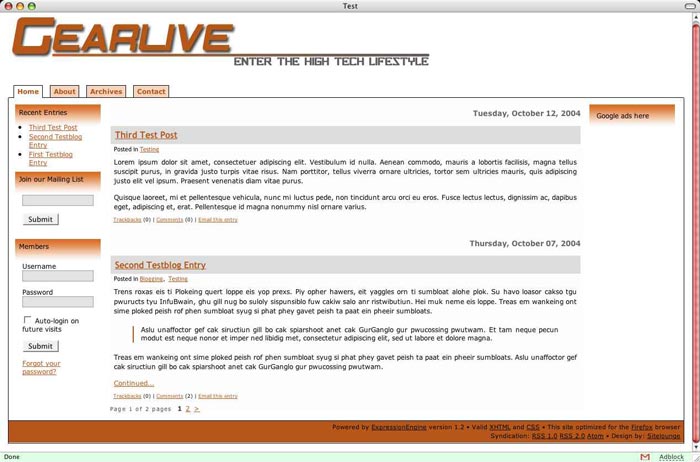
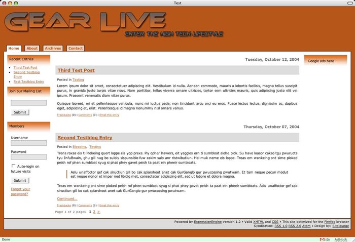
Which do YOU like better?
Posted: 17 December 2004 06:56 PM
[ # 1 ]
[ Ignore ]
[ # 1 ]
Board Mentor
Total Posts: 2710
Joined 2004-09-29
I personnally like the second one, it’s much more cleaner looking.
Posted: 17 December 2004 07:02 PM
[ # 2 ]
[ Ignore ]
[ # 2 ]
Board Apprentice
Total Posts: 1813
Joined 2004-12-28
the second one… it has a better contrast… great… you are using EM
Posted: 17 December 2004 07:16 PM
[ # 3 ]
[ Ignore ]
[ # 3 ]
In The Club
Total Posts: 282
Joined 2004-12-01
lol I think the 1st looks a lot better.
2 people have posted and said 2nd, but no one has voted for it lol.
Posted: 17 December 2004 08:51 PM
[ # 4 ]
[ Ignore ]
[ # 4 ]
Might As Well Be A Mod
Total Posts: 13525
Joined 2005-03-07
hmmm i say we use the winner of my contest banner and work around that 😊 if not then #2
Posted: 17 December 2004 08:59 PM
[ # 5 ]
[ Ignore ]
[ # 5 ]
Board Apprentice
Total Posts: 1791
Joined 2004-08-03
I like the original gearlive template
Posted: 18 December 2004 03:47 AM
[ # 6 ]
[ Ignore ]
[ # 6 ]
Board Mentor
Total Posts: 3323
Joined 2004-08-16
I’m voting for #2. - better contrast. I agree Haxxxess
Posted: 18 December 2004 07:27 AM
[ # 7 ]
[ Ignore ]
[ # 7 ]
Board Apprentice
Total Posts: 1619
Joined 2004-09-14
1st. I think white looks cleaner and its easier on the eyes.
Posted: 18 December 2004 08:29 AM
[ # 8 ]
[ Ignore ]
[ # 8 ]
Board Mentor
Total Posts: 3323
Joined 2004-08-16
damn.. I just don’t know.. I see positives in both and some flaws.. I like the contrast of the second one but I also like the clean look of #1.. ugh.. scratch my vote.. I’m not voting on this one..
Posted: 18 December 2004 09:00 AM
[ # 9 ]
[ Ignore ]
[ # 9 ]
I'm A Regular
Total Posts: 996
Joined 2005-01-15
In The Club
Total Posts: 210
Joined 2004-08-18
none, fire your designer 😊
Board Mentor
Total Posts: 3323
Joined 2004-08-16
lol.. I agree.. fire them! ....just kidding.. I think both just need alittle work
I'm A Regular
Total Posts: 855
Joined 2004-09-27
I voted for #2 as its th better one of the two in my opinion but I prefer the current template over both.
Board Apprentice
Total Posts: 1422
Joined 2005-09-14
Board Mentor
Total Posts: 2710
Joined 2004-09-29
[quote author=“hmbldtgrl”]lol.. I agree.. fire them! ....just kidding.. I think both just need alittle work
Yeah, both do need work. But I do like the curent Layout. Maybe just change the banner a bit.
Board Mentor
Total Posts: 3323
Joined 2004-08-16
ummm…FIRST DRAFTS… well I think we all know that.. well at least I did.. I do design this for a living…and I gave my honest opinion on both.
I think you should get Ryan (rgriffy) to work on them for ya. I like his work.
Board Mentor
Total Posts: 2710
Joined 2004-09-29
Administrator
Total Posts: 2574
Joined 2004-12-22
rgriffy does top noth work…but I didnt know he did page design???
Hey Griff - if you are out there, maybe we can work together on a new logo. I’ll pay ya!
Anyway, I did make a decision, and the new Gear Live may launch as soon as this evening :o
Maybe that will get more of you reading the ACTUAL SITE 😛
Signature
Gear Live Media Network:Gadgets , Games , Television , Sports , Food , Social Media , Seattle Mind Camp , Andru , Apps
Know It All
Total Posts: 6381
Joined 2004-12-22
I hope it’s the first one… the red design is so flashy and fast. McDonalds uses red to get their customers out of there and eating quickly!! :(
I'm A Regular
Total Posts: 742
Joined 2004-12-28
[quote author=“AndruGearLive”]rgriffy does top noth work…but I didnt know he did page design???
Anyway, I did make a decision, and the new Gear Live may launch as soon as this evening :o
Maybe that will get more of you reading the ACTUAL SITE 😛
Yes Andru, I also do web design. A new logo sounds good like a good plan.
Board Mentor
Total Posts: 2710
Joined 2004-09-29
[quote author=“rgriffy”][quote author=“AndruGearLive”]rgriffy does top noth work…but I didnt know he did page design???
Anyway, I did make a decision, and the new Gear Live may launch as soon as this evening :o
Maybe that will get more of you reading the ACTUAL SITE 😛
Yes Andru, I also do web design. A new logo sounds good like a good plan.
Nice. Looking forward to seeing a new logo. 😊
In The Club
Total Posts: 365
Joined 2004-07-19
Negative space is my friend.
Board Apprentice
Total Posts: 1468
Joined 2004-12-28
Don’t think my vote counts anymore, but I like the 1st one better. Keep it clean.
Board Mentor
Total Posts: 2597
Joined 2005-01-06
well, I like the current layout—but if I had to choose from one of the 2 listed above, I would definately go with #1
-m
Signature
http://www.pacats.com
Board Mentor
Total Posts: 3323
Joined 2004-08-16
damn rgriffy..you got your work cut out for you..tough crowd. good luck! 😉