
Windows 7 media player - Windows 7 Screenshots
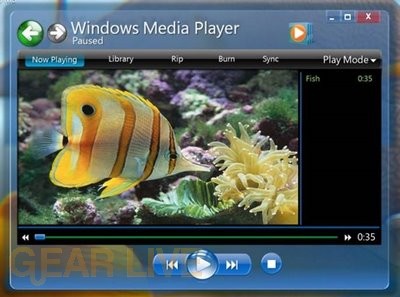
Here is a look at the early version of Windows Media Player in Windows 7.
Back to thumbnails | View full size image
| ‹ | Windows 7 app wheel | Windows 7 Live Messenger | › |
Advertisement


Advertisement
© Gear Live Inc. {year} – User-posted content, unless source is quoted, is licensed under a Creative Commons Public Domain License. Gear Live graphics, logos, designs, page headers, button icons, videos, articles, blogs, forums, scripts and other service names are the trademarks of Gear Live Inc.
Comments
Lookes like a setup of the media center mixed with the windows media player
posted by: crazygamer8451 · 5/31/08
with the media player i dont like to see so many big buttons i like more viewable area instead of buttons i dont like the lay out of this media player
posted by: mental tiger · 5/31/08
Doesn’t look like they’ve changed much from Media Player 11, but it might just be me.
posted by: BoogerJay · 6/1/08
to me it looks the same style
posted by: acid2k1 · 6/1/08
yup, the preview of WMP 12 seem doesn’t changed much from its previous WMP 11,but for functionality, stability and performances i do hope for a significant increasing performances
posted by: nichan · 6/1/08
Wow, Windows 7 Media Player looks great. It is very neat, not so mess with lots of button or other options. It gives a relaxed look.
posted by: Linu · 6/2/08
Looks pretty compact. Not gonna do.
posted by: Crater · 6/3/08
I like the looks of this one it looks smaller then the other ones. Looks like it might be easier to use also.
posted by: littlebull · 6/3/08
This looks a lot better than the current Windows Media Player 11 in Vista… The top row of buttons looks a lot more streamlined, and easier to use, and the transparency of the player makes it that much more appealing to the eye!
posted by: BuckeyeFanatic25 · 6/4/08
it looks smaller to me, i just think that we will be impressed with windws 7. i cant wait to see it and try it in person. i think all of windows 7 is appealing to the eye!!
posted by: littlebull · 6/5/08
It does look pretty nice, but I think the top part of it is a bit huge for my liking. I’m pretty sure I would know it was Windows Media Player if I opened it up and that font is quite large, haha.
posted by: jess1ca · 6/6/08
The new look of Windows Media Player looks better and more futuristic in Windows 7. I like it! I agree with Jessica, there is a lot of extra space within the window. I don’t like the blue color too, but I’m sure that’s customizable!
posted by: SG · 6/7/08
It looks too much like media center than anything else. Hopefully it looks better in the end.
posted by: SmileyXX · 6/11/08