
Windows 7 Misc screenshot 4 - Windows 7 Screenshots
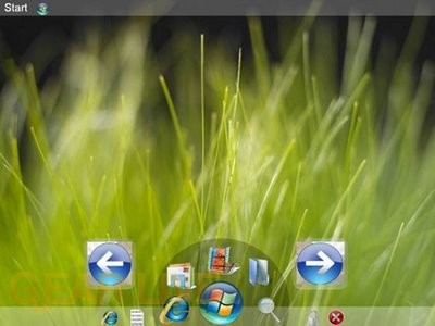
This one kind of reminds me of the OLPC XO operating system layout.
Back to thumbnails | View full size image
| ‹ | Windows 7 Misc screenshot 3 | Windows 7 Misc screenshot 5 | › |
Advertisement


Advertisement
© Gear Live Inc. {year} – User-posted content, unless source is quoted, is licensed under a Creative Commons Public Domain License. Gear Live graphics, logos, designs, page headers, button icons, videos, articles, blogs, forums, scripts and other service names are the trademarks of Gear Live Inc.
Comments
Is it me or does Windows 7 show off huge icons, shown in most of the screenshots?
posted by: BoogerJay · 6/1/08
why do you want huge back and forward icons on your desktop
posted by: acid2k1 · 6/2/08
Yeah, the arrows don’t look very good.
posted by: Crater · 6/3/08
ok that layout looks a little confusing maybe because i havent ever seen a layout look like that before. I like the backgroud though looks almost real
posted by: littlebull · 6/3/08
That seems like the most inefficient design that I have seen out of this entire gallery… why would that design make any sense?? The start menu is in the upper left corner of the screen, and yet you have a Mac OS X dock-like thing at the bottom which you rotate through in a counter-clockwise or clockwise fashion. On top of that, it looks like you have “quick launch” icons on either side of that dock-like thing. So much confusion!
posted by: BuckeyeFanatic25 · 6/5/08
Everything is way too cluttered on the bottom middle of the screen. Space some of it out a bit and get rid of the forward and back buttons then it might look pretty good.
posted by: SmileyXX · 6/11/08